

Evolving Lighting
A recurring theme in photography is experimenting and learning lighting techniques. I don’t recall who exactly said this, but I’m quite confident many professionals have said something similar, “photographers don’t work with cameras, they work with light.” The nearest analogue I can think of is that carpenters don’t work with tools, they work with wood - an imperfect comparison, but not the worst way to understand things. Craftspeople, artists, and creators work within their medium based on what that medium is capable of conveying.
Looking at these two test shots, one has “better” lighting than the other, which I’ve outlined in the margin notes for each image, and also explained in each image’s lighting diagram.
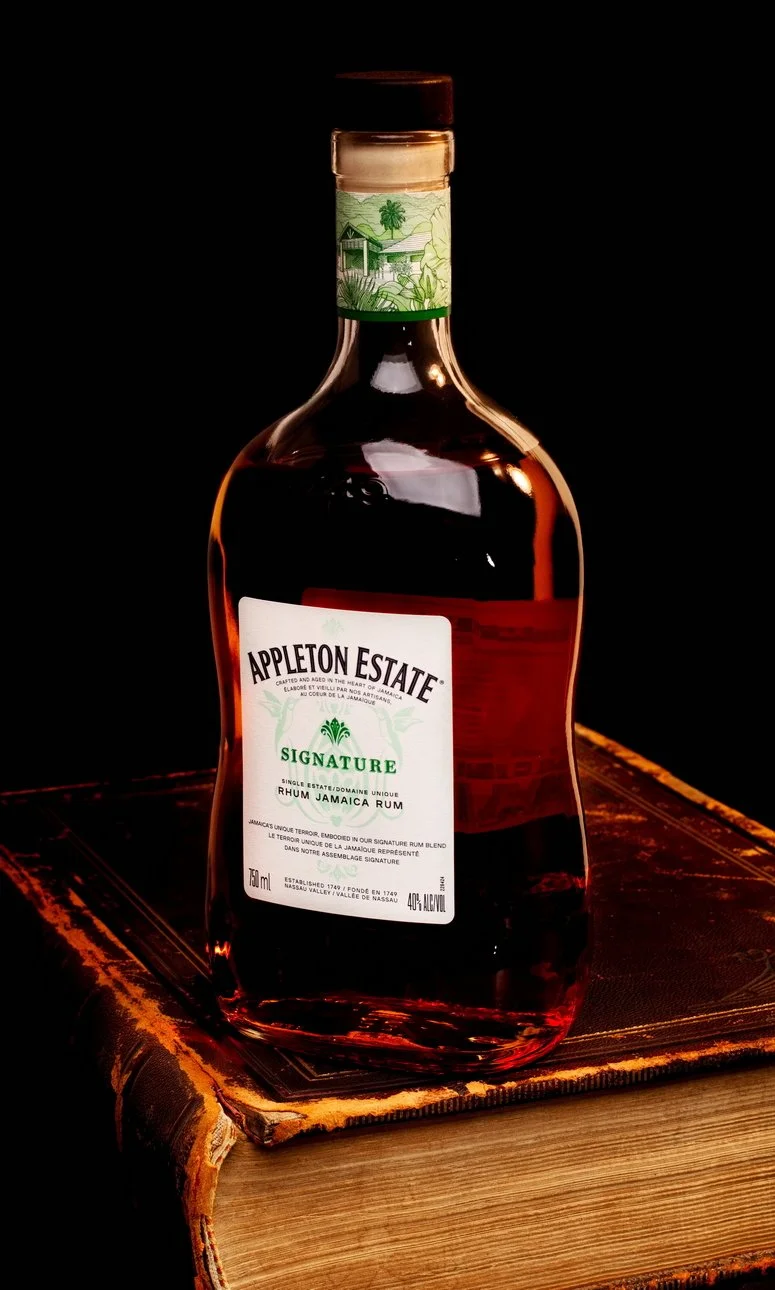
It’s not bad, it’s just not great.
The main problem with this image is the highlight dead centre on the bottle. It’s the square shape of the boom mounted softbox, so it gives a broken up highlight that doesn’t follow the curve of the bottle.
What worked and what didn’t?
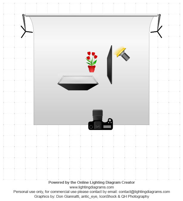
Diagram description: An amber gelled strobe was bounced off the background to give the image a slightly aged feel, and bring up the texture in the book. A negative fill reflector was used on the right side of the bottle to prevent the gelled strobe from overpowering the image.
A softbox was boom mounted and angled overhead of the bottle to provide greater exposure on the front of the bottle. While this gave a bit more color to the bottle and its contents, the highlight it gave the bottle didn’t accentuate the curve and shape of the glass, and gave an awkward looking highlight.
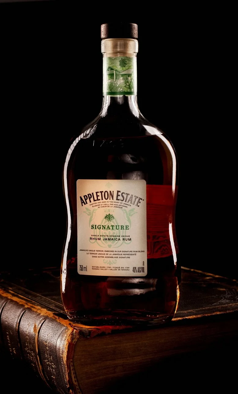
Look at those curves…
Repositioning the lights gave the bottle a similar exposure, and more importantly moves the highlights on the bottle to the curved edges.
Now the shape and depth of the bottle is more visible because the highlights are outlining the bottle, and hinting at its contents.

Some jiggery-pokery later…
Two strip boxes were used behind the bottle at an angle, with a silvered reflector in front of the bottle. The narrower light spread from the stripboxes puts rectangular highlights along the curve of the bottle.
The silvered reflector provided fill at the front without leaving as harsh and glaring a highlight. This could have been further reduced by increasing the size of the reflector.